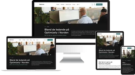
Epinova has developed an image management module that makes it easy for developers to define different image formats, and then easily apply these to image properties on individual properties on a content type/template. This, in turn, helps editors who don't have to think about optimizing the images.
For example, sometimes images need to be high-resolution for desktop Hero images, while the same image doesn't need to be that large if you're using a mobile phone.
Performance and focus point
This module supports dynamic loading of images, which increases performance and speeds up loading time. The module also gives the editor the ability to set the focal point of the image, as well as provide extended cropping possibilities of images.
This helps editors choose images with the right size and support for help texts. Also included are validation warnings if an image is too small than appropriate.
Formatting images in free text
Responsive images also format images in free text. You can register a standard format for the entire website or a specific property. It is also possible to give the editor the option to choose a number of predefined image formats.